15-Interactive-Visualizations-and-Dashboards
Plotly Homework
index
Home page
db
Images
js
app.py
Belly Button Biodiversity
.png)
.png)
.png)
.png)
.png)
.png)
.png)
.png)
In this assignment, you will build an interactive dashboard to explore the Belly Button Biodiversity DataSet.
Step 1 - Plotly.js
Use Plotly.js to build interactive charts for your dashboard.
-
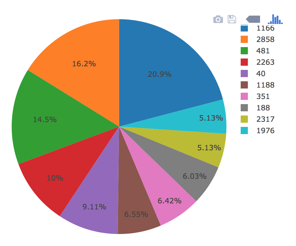
Create a PIE chart that uses data from your samples route (
/samples/<sample>) to display the top 10 samples.-
Use
sample_valuesas the values for the PIE chart -
Use
otu_idsas the labels for the pie chart -
Use
otu_labelsas the hovertext for the chart
-
-
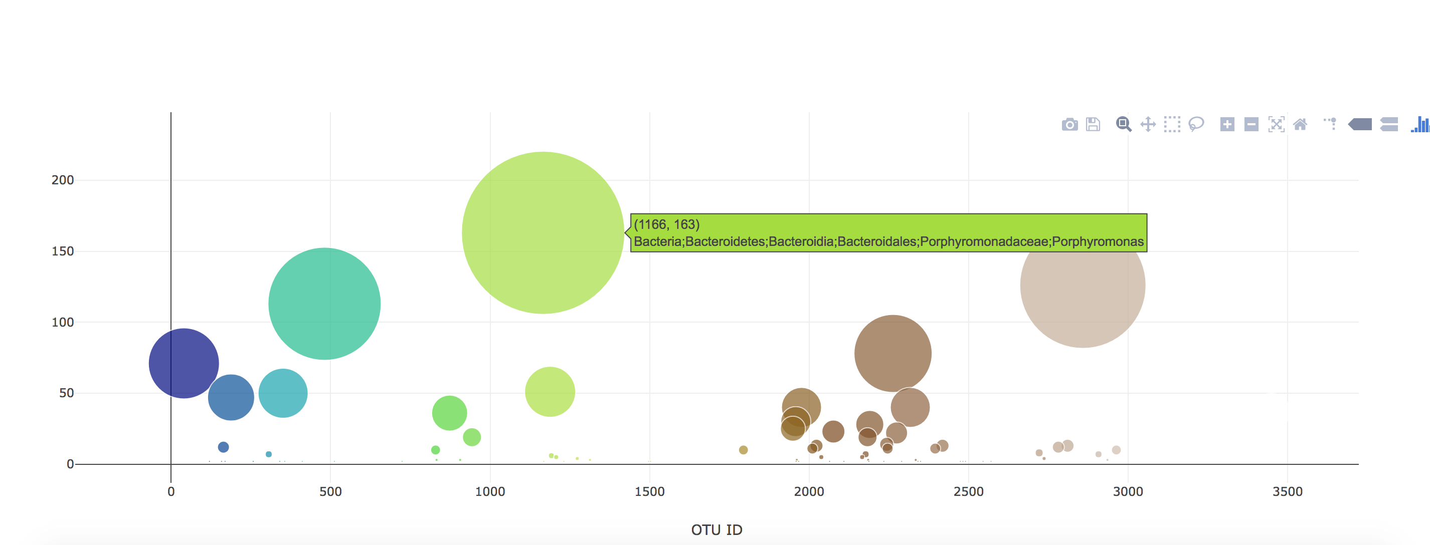
Create a Bubble Chart that uses data from your samples route (
/samples/<sample>) to display each sample.-
Use
otu_idsfor the x values -
Use
sample_valuesfor the y values -
Use
sample_valuesfor the marker size -
Use
otu_idsfor the marker colors -
Use
otu_labelsfor the text values

-
-
Display the sample metadata from the route
/metadata/<sample>- Display each key/value pair from the metadata JSON object somewhere on the page
-
Update all of the plots any time that a new sample is selected.
-
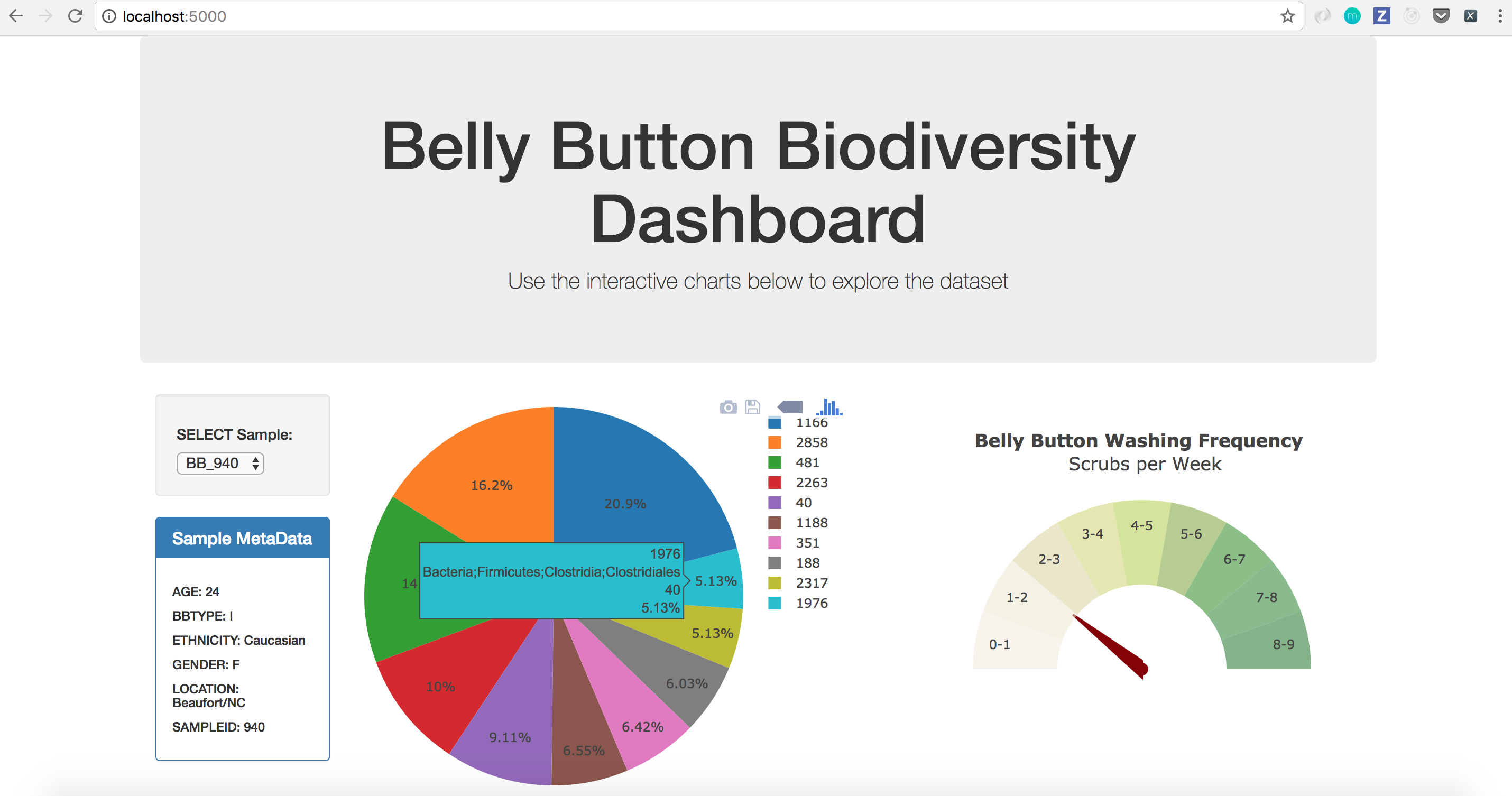
You are welcome to create any layout that you would like for your dashboard. An example dashboard page might look something like the following.
Step 2 - Heroku
Deploy your Flask app to Heroku.
-
You can use the provided sqlite file for the database.
-
Ask your Instructor and TAs for help!
Advanced Challenge Assignment (Optional)
The following task is completely optional and is very advanced.
-
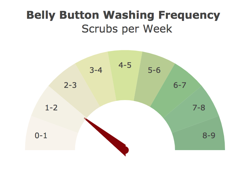
Adapt the Gauge Chart from https://plot.ly/javascript/gauge-charts/ to plot the Weekly Washing Frequency obtained from the route
/wfreq/<sample> -
You will need to modify the example gauge code to account for values ranging from 0 - 9.
-
Update the chart whenever a new sample is selected
Flask API
Use Flask API starter code to serve the data needed for your plots.
- Test your routes by visiting each one in the browser.
Hints
-
Don’t forget to
pip install -r requirements.txtbefore you start your server. -
Use
console.loginside of your JavaScript code to see what your data looks like at each step. -
Refer to the Plotly.js Documentation when building the plots.
Copyright
Data Boot Camp © 2018. All Rights Reserved.